With the original Echo Show, Amazon added a new dimension to the smart speaker. To critics, the device was little more than a station tablet. For Amazon, however, the product unlocked a new vertical in the rapidly expanding category. The day to usefulness wasn’t always clear, but the potential certainly was, as Amazon and the competition looked to corner the smart home market.
Like most of the company’s first generation products, however, the hardware wasn’t great. The first Show was big and clunky. It looked dated before it even arrived in living rooms and kitchens. But it got the job done.
While the company hasn’t released sales figures for the product, the first gen clearly sold briskly in its early days, according to rankings. The numbers were ultimately hobbled by a war with Google that resulted in YouTube being pulled from the platform, but on a whole, the device appears to be a hit.

It’s already inspired a number of copycats. In January, Google announced a new Smart Display category relying on third parties to product their own Assistant-powered take on the device. And later this week, it’s expected to introduce its own competitor, the Home Hub. It’s fitting, then, that the second-gen Show bears Google’s unmistakable influence. Heck, it’s kind of theme in this latest batch of Echo devices.
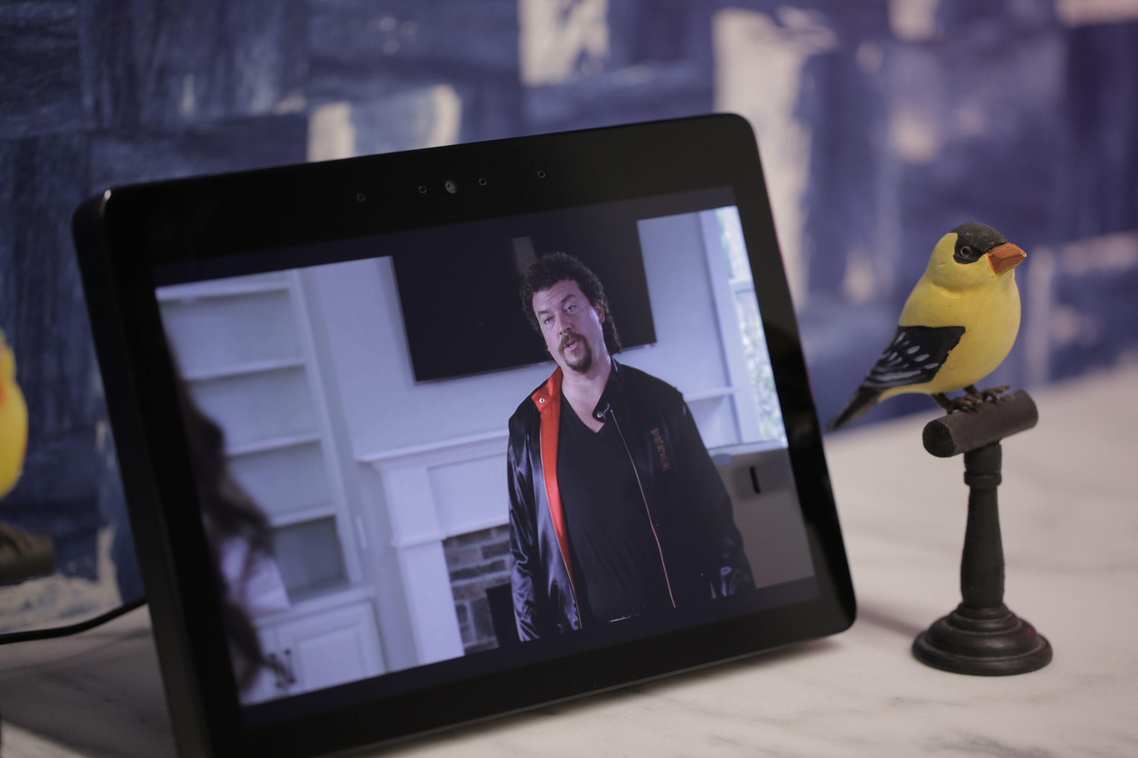
There’s little question that the new show is much better looking product than its predecessor. The big, thick, plasticky look has been traded in for something a bit more homey, with a softer, fabric covering. The front, which was previously home to both display and speaker, is now all screen — meaning those tablet comparisons aren’t going away any time soon.
Still, from a pure design perspective, Lenovo’s Smart Display is the one to beat. It’s still far and away the best looking of the bunch — though the aforementioned Home Hub could give it a run for its money in the near future.
The design choice means there’s a lot more room for screen, which has been increased from seven to 10.1 inches (with a still fairly sizable bezel). That extra real estate makes the product a more compelling offering for watching short videos or episodic TV shows (I don’t know that I’d recommend it for a full film just yet) and finally offers enough space for something like a browser to make sense on the product.
The speaker, meanwhile, has been moved to the rear of the device. It’s a decision that makes sense from an aesthetic perspective, but is a bit less than practical. When listening to music while writing this review, I found myself actually flipping it around.
Sound quality has been notably improved with improved drivers and Dolby bass, but things get a bit muffled when faced away from you. The bass is also a bit too powerful for its own good here, contributing to a muddying of the sound quality. Thankfully, Alexa now understands you when you ask her to turn down the bass.
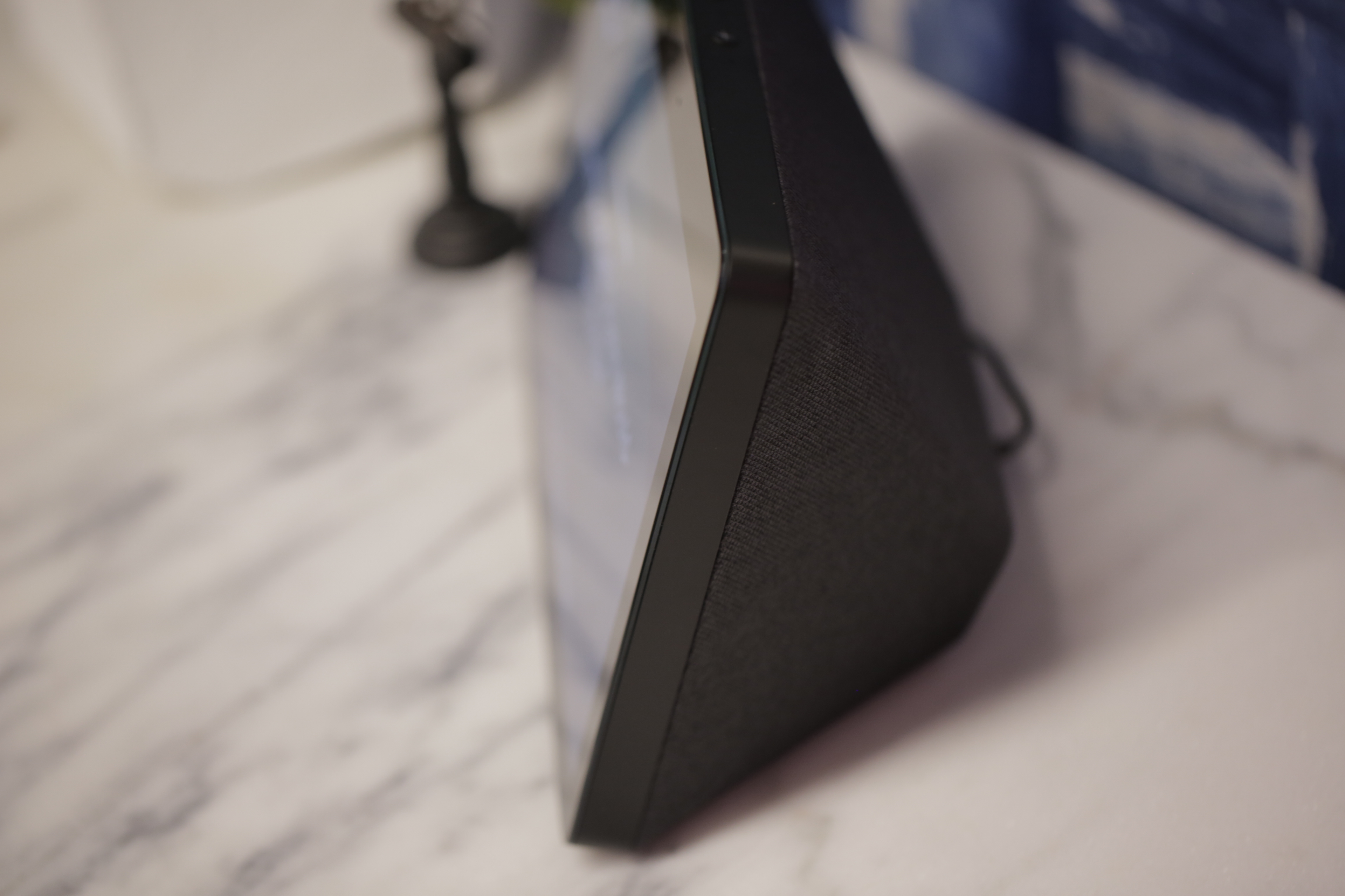
Things improve a bit when you place it around six inches from a wall, reflecting the sound back at you. Of course, not every home set up can accommodate that orientation. Either way, I wouldn’t recommend looking to the Show as your primary music listening device. Apple and Google’s high end speakers simply sound better — or build your own using the various modular pieces the company announced at its last event.
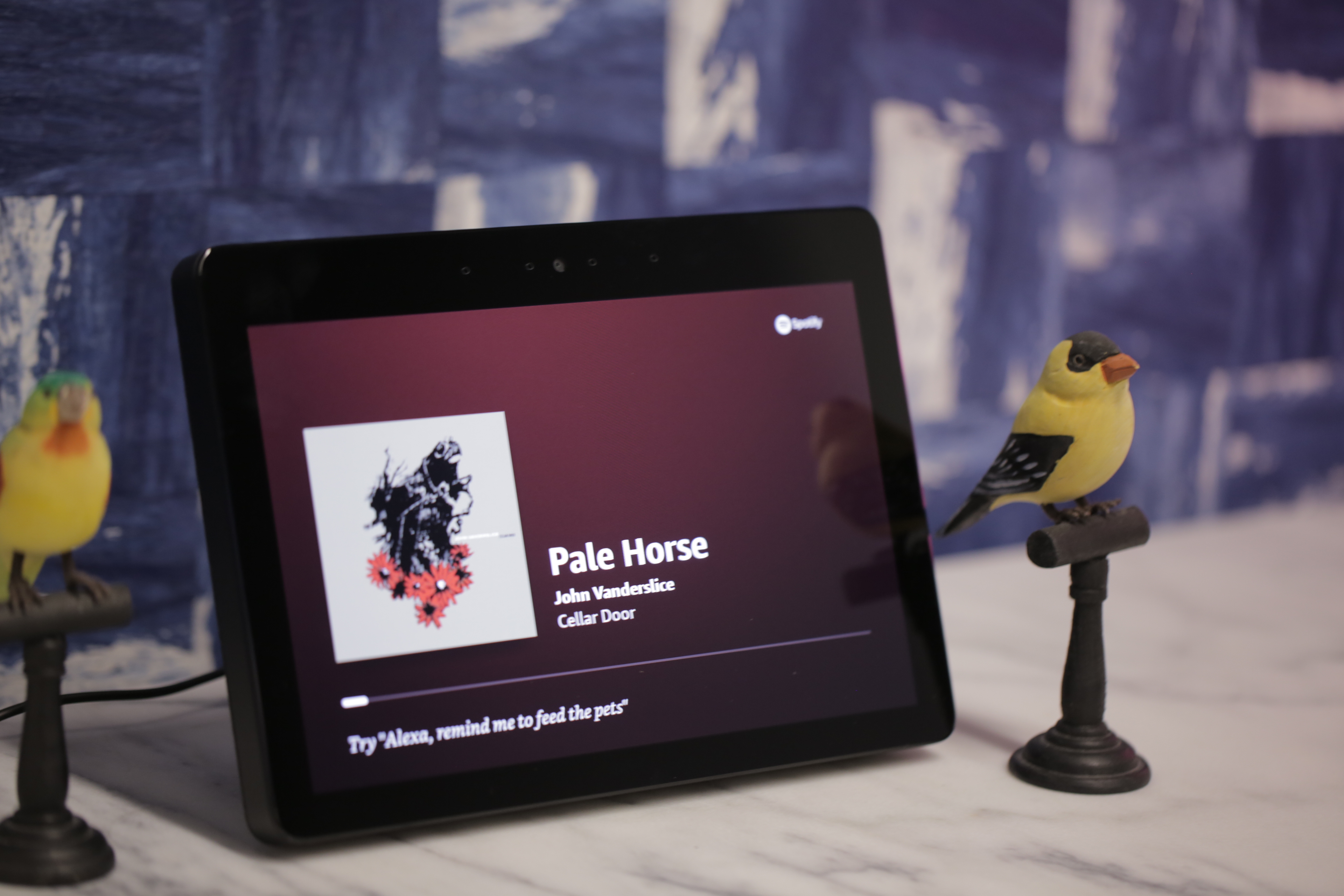
With a larger display, the new Show demands touch. Amazon clearly recognized this during the redesign. While, like its predecessor, it’s designed to be voice-first device touch-based interactions are more prevalent here.
Exhibit A is the addition of Firefox. It’s a bit of a strange one. You can call it up with an, “Alexa, open Firefox,” but actually browsing the web is a bit trickier. There’s no skill yet for, say, “open TechCrunch.com in Firefox.” Rather, you’ll have to open Firefox and either type the URL with two fingers, or click the microphone icon to speak it.
It’s a nice option certainly, if a bit clunky. Also, there’s no multitouch pinch to zoom here — in fact, so far as I can tell, there’s no way to zoom in at all. What the browser does afford, however, is a workaround for YouTube. Say “Alexa, open YouTube,” and the Show will offer you the choice of watching content in either Firefox or the Silk browser. Sure, it’s not ideal compared to a native app, but until the companies kiss and make up, or, more likely, Amazon launches its own competing service, it will have to do.
The other big news here is a bit of a no-brainer. After bringing smart home hub functionality to the Echo line with the Plus, Amazon has done the same with the Show. The smart screen now features a Zigbee hub inside. Connecting devices is pretty straightforward — just put them in pairing mode and say “Alexa, discover my devices.” If everything goes right, the whole process should take under a minute.
Thankfully, an app redesign has arrived alongside the new devices, so those smart devices can be accessed on your mobile device, along with the Show. The app also lets users routines around groups of devices, so you can, say, turn up the lights, turn on the coffee and get the day’s news (shudder) with an “Alexa, good morning.”
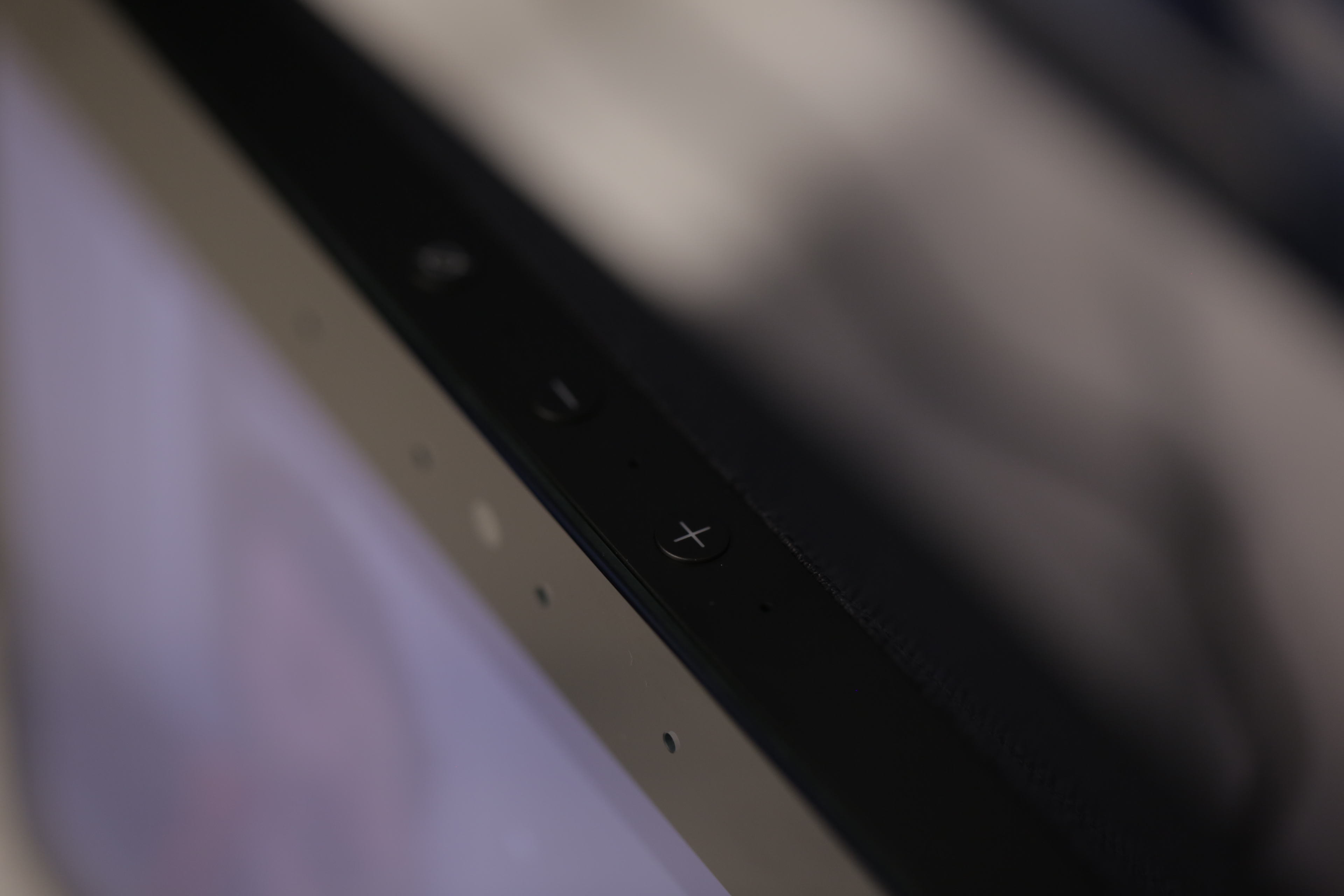
The new Show is nice upgrade over its predecessor. It’s better looking, has a bigger screen and improved (if backwards) speakers, while smart home hub functionality and last year’s addition of security camera monitoring make it a control panel for the smart home. The ball is in your court, Google.
from TechCrunch https://ift.tt/2C4R1sf

No comments:
Post a Comment