The Portal is a head scratcher. It’s a chat app that manifested itself into a hardware through sheer force of will. The first commercially available product from Building 8 isn’t as instantly iconic a piece of hardware as Snap’s Spectacles. In fact, at first glance, the device seems like little more than an Echo Show/Google Home Hub competitor.
And then there’s the matter of timing. In a meeting with TechCrunch ahead of launch, Facebook’s hardware team was quick to list the various ways the company is proactively protecting user privacy, from a camera button to a physical lens cap. The social media giant has always been a lighting rod for these issues, but 2018 has been particularly tough, for reasons summed up well in Taylor’s simply titled post, “Facebook, are you kidding?”
What’s most peculiar, however, is in this age of multi-tasking devices, the Facebook Portal and Portal+ are devices that are designed to do one thing really well. Rather than pushing to develop a true Echo competitor, Facebook’s first ground-up piece of hardware is essentially a teleconferencing device for friends and family.
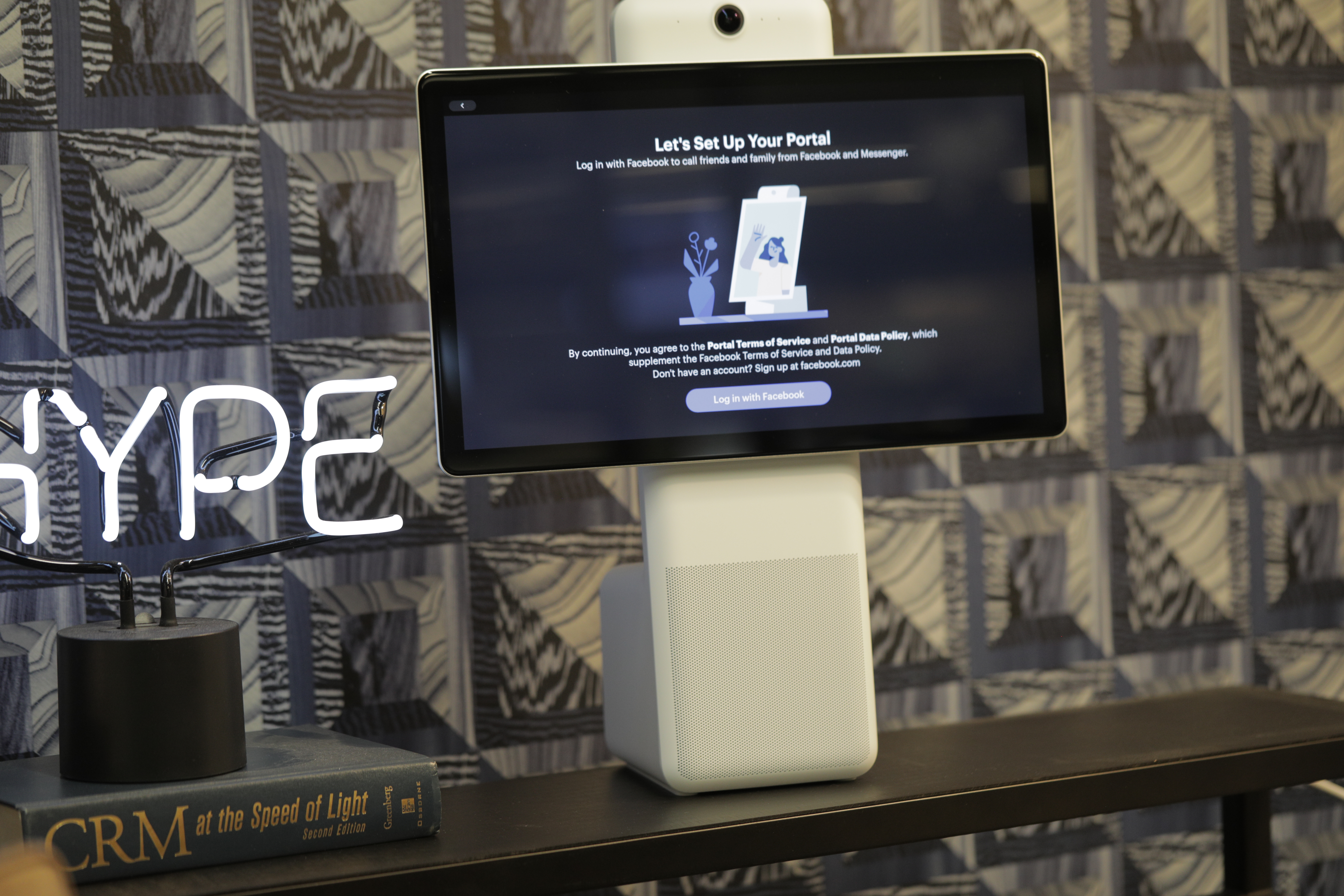
It is, in the product’s defense, one wrapped in solid hardware design with some clever choices throughout. If the Portal ultimately winds up lining the thrift store shelves of history, it won’t be due to choices Facebook made to serve its core competency.
Rather, it will be due to the fact that the product team has neglected some other features in the name of focusing on video chat — a feature that’s got no shortage of delivery devices. Facebook told me that Portal’s other features will be updated based on user feedback — almost as if the company is unsure what, precisely, customers would want from such a device outside of video chat.
The timing of the device is certainly telling. Facebook is clearly banking on selling a lot of Portals for the holidays. You can practically see the ads playing out, as some melancholy voice sings the beginning strains of “I’ll Be Home for Christmas.” The first spot isn’t as on the nose, but similar heart-strings are tugged, as evidenced by the “Feel There” title. That’s Facebook’s pitch in a nutshell: We know it sucks you can’t be with your nieces and nephews or elderly parents right now, but hopefully this screen will do the trick.
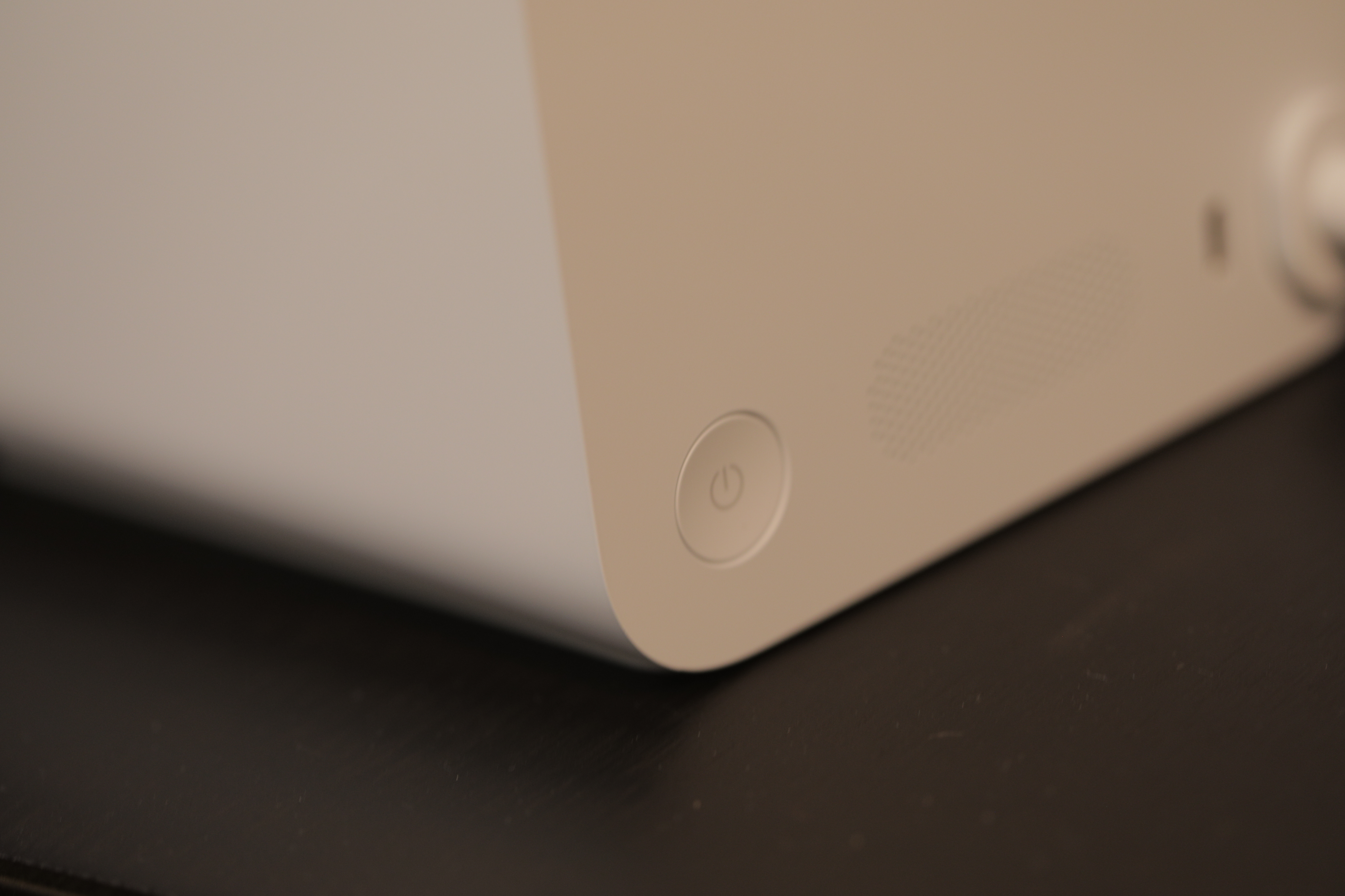
From a hardware design perspective standpoint, I’m on board. The smaller Portal looks quite a bit like Lenovo’s Google Assistant-powered Smart Display, albeit with the different speaker placement. I’m into it. Lenovo’s device is probably the best-looking smart screen around, and the Portal is an identical cousin with a slightly different haircut.
The Portal+ — the model that’s been hanging on my office desk for a few days now — is the more innovative of the two products from an industrial design perspective. It is, essentially, an ultra-wide 15.6-inch tablet mounted atop a tall, thin base. The display is connected to the base via a joint that allows it to swivel smoothly between portrait and landscape mode.
The screen is 1080p — plenty good for video chat, and a big step up from the Echo Show and (especially) Google Home Hub. Of course, the large footprint means it’s going to be tough for those in smaller spaces to find an ideal spot (says the guy living in a one-bedroom apartment in New York City). At present, it’s sitting atop my AirPort router.
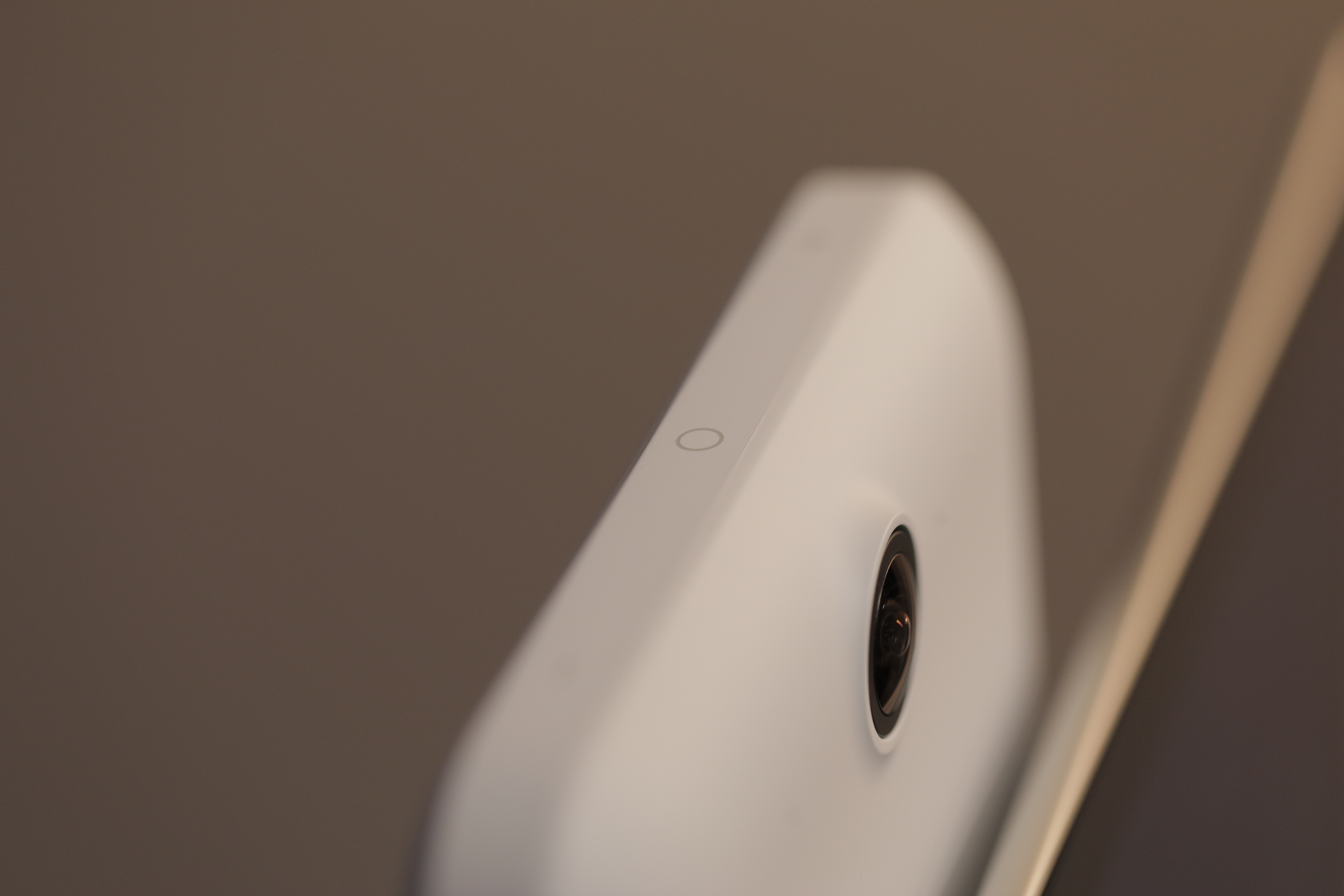
The all-important camera is positioned an inch above the screen, like an unblinking eye of Sauron. The 12-megapixel camera can do 5x zoom and capture movement within a 140-degree range. The four-mic array flanks the lens on either side, doing double duty of listening to commands and noise canceling during chats.
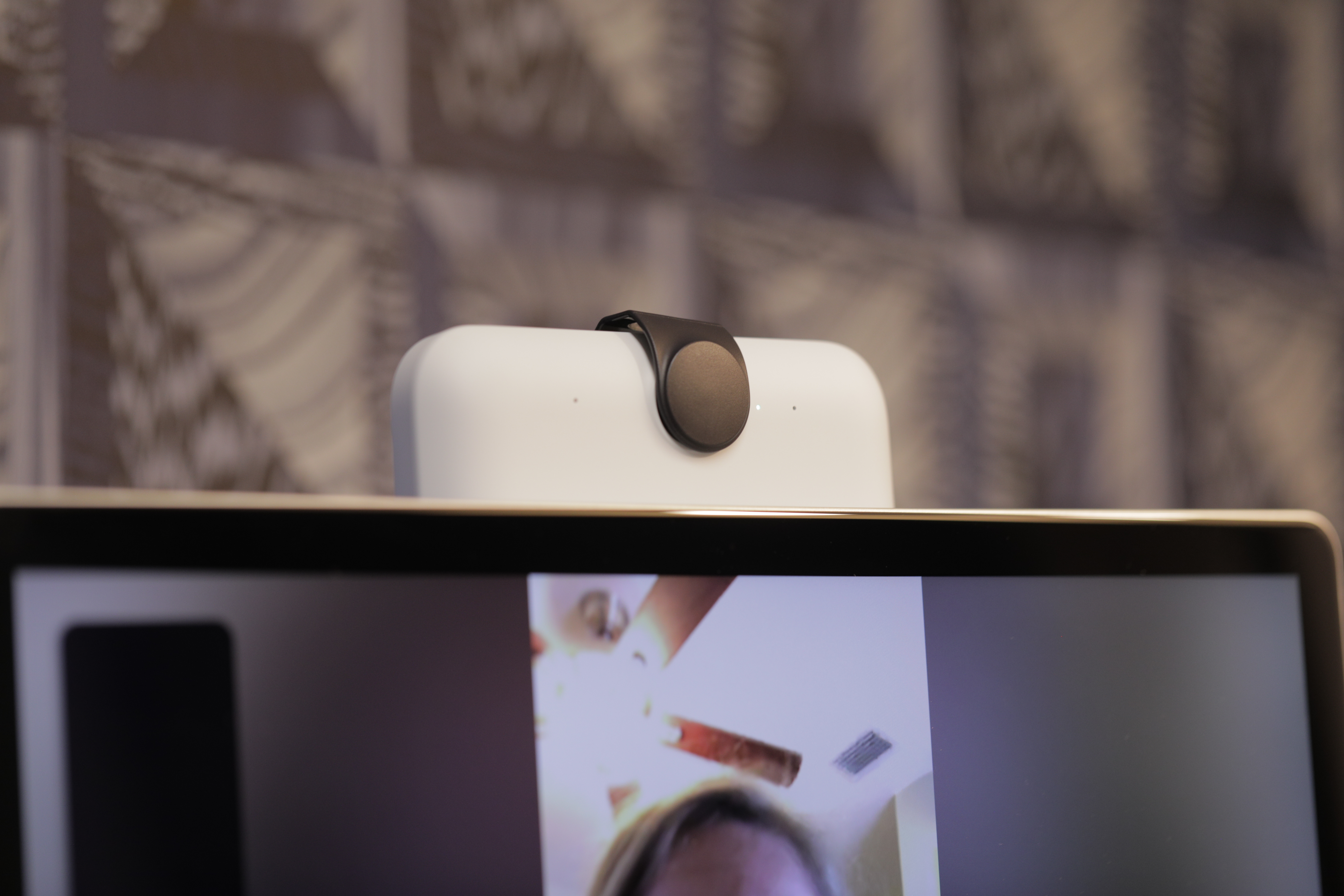
Along the narrow top ridge are three inductive buttons — two volume, one to turn off the camera and mic. When you hit that last one, a notification will pop up on screen, and a small red light will illuminate just to the right of the camera, for added assurance. As an extra measure, Facebook also tossed in a plastic clip to physically cover the camera.
I found myself making a point to keep the lens cap on the majority of the time when I was using the device to chat. When I was talking to someone, I slipped it to the side, but kept it clipped on the base. The little piece of plastic is pretty easily lost. If Facebook does end up making another one of these, a mechanical lens cap like the kind you find on a point and shoot camera is probably the way to go.
The button placement is a bit of a shit show. The way I have the Portal+ set up on my desk, the buttons are above eye-level. Makes sense, you want the display right around your face, you know, to look at it. This means when I want to, say, change the volume, I find myself fiddling in the dark for them. Given that they’ve got no tactility, I invariably end up hitting the wrong one, more often than not jacking up the volume in the process.
Similarly, I often end up hitting a button or two when attempting to clip on the lens cap. Next time out, Facebook needs to either go with physical buttons or find a better spot to place them — tough, I know, given the odd shape of the thing.
The screen placement ensures that the display doesn’t obscure the camera in either portrait or landscape — though when swiveling, the corners do eclipse the shot. When in portrait, the bottom of the display does block roughly half of the bottom speaker. This is a bit of a design flaw, though surprisingly, it doesn’t dampen the sound as much as I’d initially expected. That said, when you’re using the device to listen to music, keep it in landscape mode. In fact, I found myself keeping it that way the majority of the time I was using it, regardless.
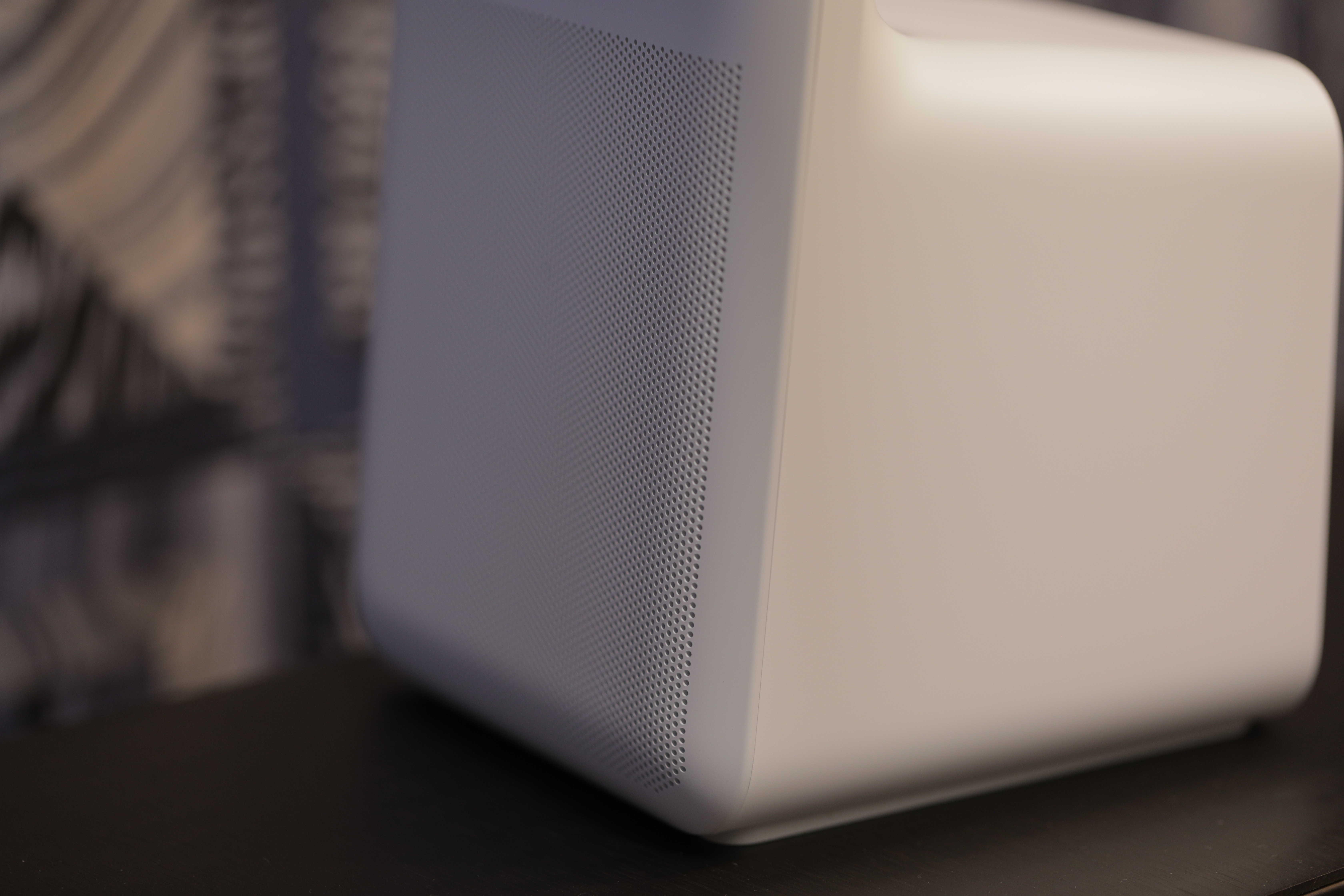
The sound quality on the thing is decent. I haven’t had a chance to put it up against the standard Portal, but the deluxe version sports a more complex speaker array — 20w (2 tweeters, single 4-inch bass) versus 10w (2 full-range drivers). Like all of these smart displays, I’m not going to recommend this as your default home stereo, but I’ve been using it to listen to Spotify all day, and have been largely enjoying the experience.
The Portal’s interface is an extremely bare-bones experience. The UI flips between two primary cards. The primary is, naturally, a list of your Facebook contacts. Up top are the six you most regularly chat with, and below are your hand-picked favorites. One of the nice bits here is that the people you speak with don’t actually need a Portal to talk. They can chat with you on their phone or computer.
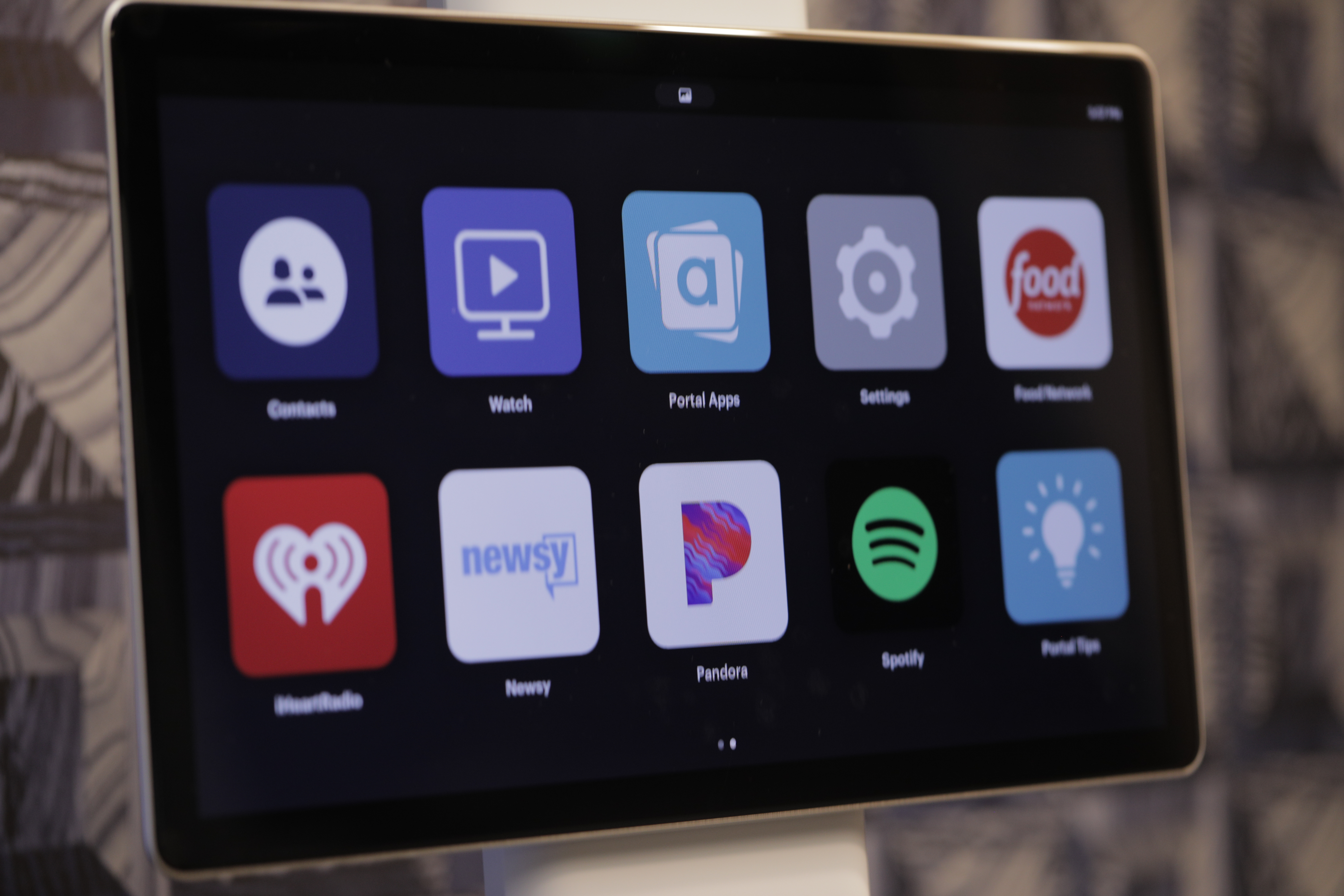
Swipe left and you get a screen full of large icons. From here you can click into Facebook videos or pick from your Portal apps — Food Network, iHeartRadio, Newsy, Pandora and Spotify by default.
Click into the apps icon and you’ll find that that’s really all there is for Portal apps at the moment. Thin soup doesn’t really begin to describe it. It’s a decent enough starting point, but honestly, Facebook doesn’t seem particularly interested in courting more developers or opening up the API to all comers. Again, the company is taking a very wait and see approach to just about everything here.
Still, Portal does bring some interesting innovation to video chat. To trigger the function, say “Hey Portal” and then “call [enter name here].” Simple enough. Though the actual “Hey Portal” features are essentially limited to things like making calls and putting the unit to sleep. Anything beyond that and poor Portal gets confused. Even something like “Hey Portal, turn off camera” is met with an “I can’t do that yet” in Portal’s uneven speech pattern.
For everything else, Portal defaults to Alexa — functionality you can add during the setup process. That the system relies on Amazon’s smart assistant to do much of the heavy lifting here further makes one wonder why Facebook expects users to adopt its product over the Echo.
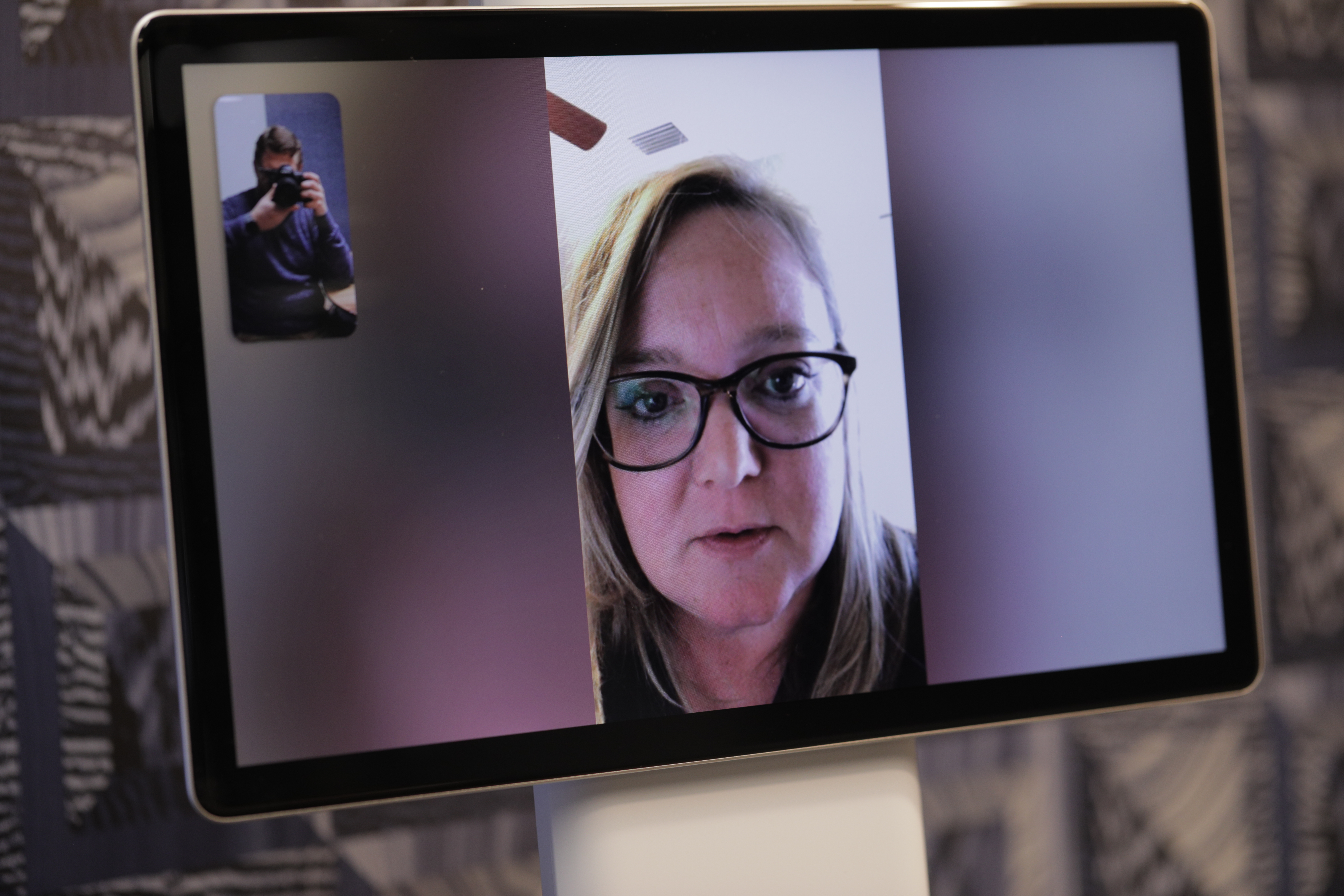
Portal’s greatest trick is its automatic zooming and panning. Using built-in AI, the system automatically tracks users and follows them around the frame. So you can, say, cook dinner while chatting and Portal will be with you the whole way. The camera will also pan in and out as additional people enter and leave the room, keeping them all in frame. While chatting with Sarah Perez (who was using the standard Portal on the other end), the camera even zoomed in on her dog when she left the room for a moment.
The zooming is smooth and the effect is impressive, owing in part to the fact that the team worked with a Hollywood cinematographer to help polish its execution. By default it moves a bit too much for my liking, slowly zooming in and out in a way that can may you low-level seasick — though you can adjust the sensitivity in settings.

My second favorite part in video chat is the ability to share songs via Spotify, Pandora and iHeartMusic. When I start playing something on my end, Sarah hears it, too. And we can both adjust our individual volumes. You can also pair the system to Bluetooth speakers or headphones, if that’s more to your liking.
This being Facebook, the system comes equipped with AR-style photo filters — 15 in all (with more coming, no doubt). You can turn yourself into a werewolf, add a disco ball — you know, the usual. They do a good job tracking your movements and add an extra little dimension of fun to the system.

Story time is another fun feature for those Portaling with young children. On your side, you’ll see a teleprompter with a story — on theirs, it’s you embedded inside an AR storybook like the Three Pigs. There are only a few stories at launch, but then most kids enjoy repetition, right?
Like the Home Hub, Portal defaults to a makeshift digital picture frame when not in use. Naturally, it defaults to photos and videos from your Facebook feed. As someone who doesn’t really use Facebook to put my life on display, the Superframe feature wasn’t really by bag, though the ability to display info like the weather and reminders of things like friends’ birthdays was nice.
Above all, Portal is a bit of a one-hit wonder. Admittedly, it does that one thing (video chat) fairly well, and at $200 for the Portal and $349 for the Portal+, it’s certainly priced competitively (and in spite of Facebook’s insistence otherwise, may be a bit of a loss leader). But it’s a hard sell compared to more well-rounded devices like the Echo Show and Google Home Hub.
And, of course, there’s all the privacy baggage that inviting Facebook into your home entails. Between the camera/speaker disabling button, lens cap, localized AI and the promise not to eavesdrop or spy, Facebook has gone out of its way to ensure users that it’s not using the device as a portal into your own privacy. But given the kind of year the company’s been having, for many potential buyers not even all of that is likely to be enough.
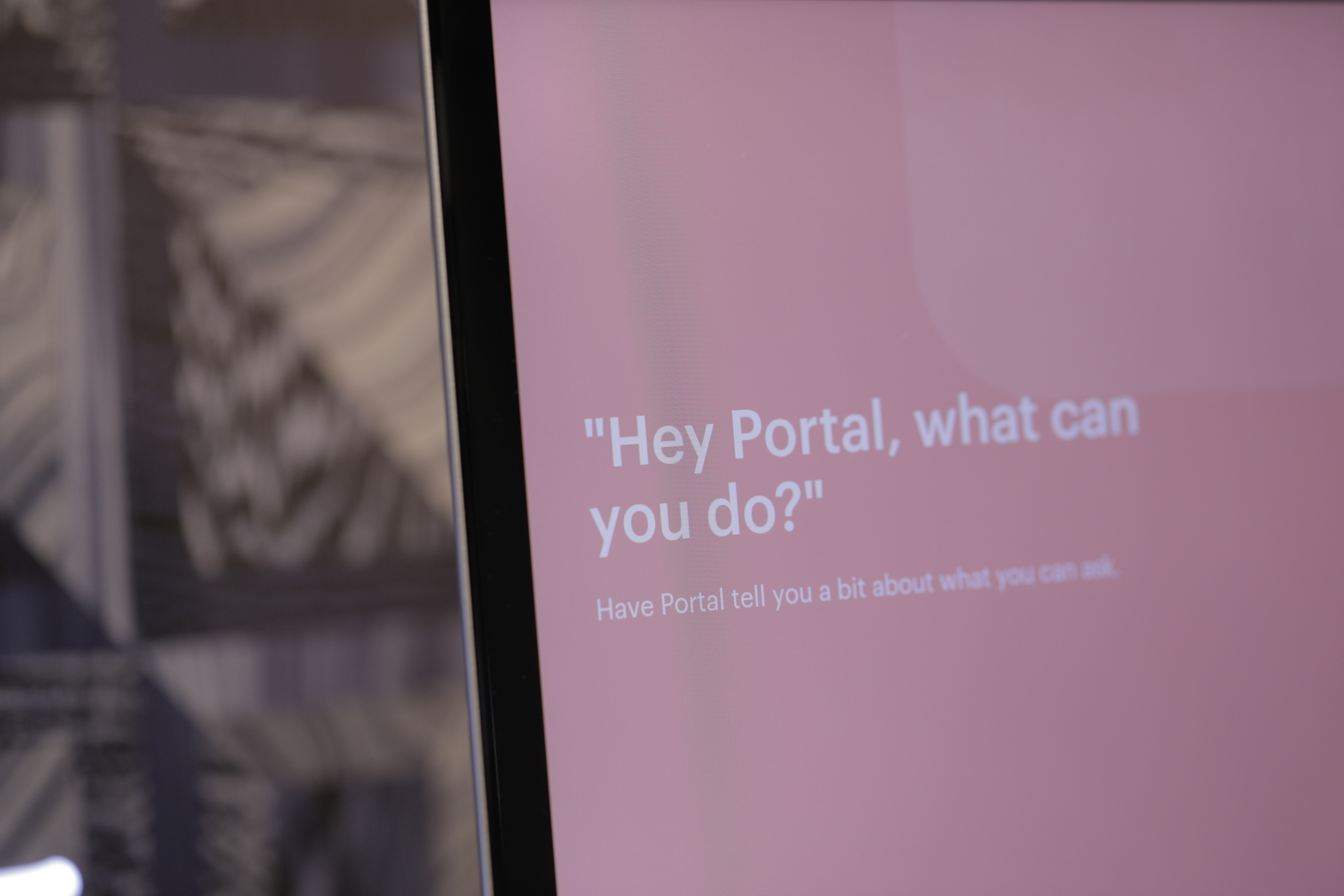
There’s a default screen saver on the device that asks “Hey Portal, what can you do?” It’s meant, of course, to prompt you to click through and discover new features. But it’s an important question — and in its current iteration, it’s not one for which Portal is able to offer a particularly compelling answer.
from TechCrunch https://ift.tt/2qCeeLm

No comments:
Post a Comment