For such a tiny device, Palm’s got a heavy lift. On the face of it, the self-titled first product from the new startup with a familiar name isn’t too radical a departure from the smartphone set. In fact, the device resembles nothing more than a diminutive iPhone, right down to the camera placement on the rear.
But the new Palm wants you to rethink your relationship with your devices. When the product was first pitched to me, a few days before I finally saw it in person, a PR rep told me the device was something new. It wasn’t a smartphone, exactly, and not quite a wearable. It was, rather, something in-between.
Last year, IDC noted that phablets (screen sizes between 5.5 and seven inches) are set to overtake smaller smartphones by next year. The march toward ever-increasing screen size shows no sign of abating. But for all of the upside of more display real estate, the human body has yet to adapt to carrying around a 6+ inch device all day, every day.
The answer to this problem — like the answer to all tech problems — is, naturally, more technology.
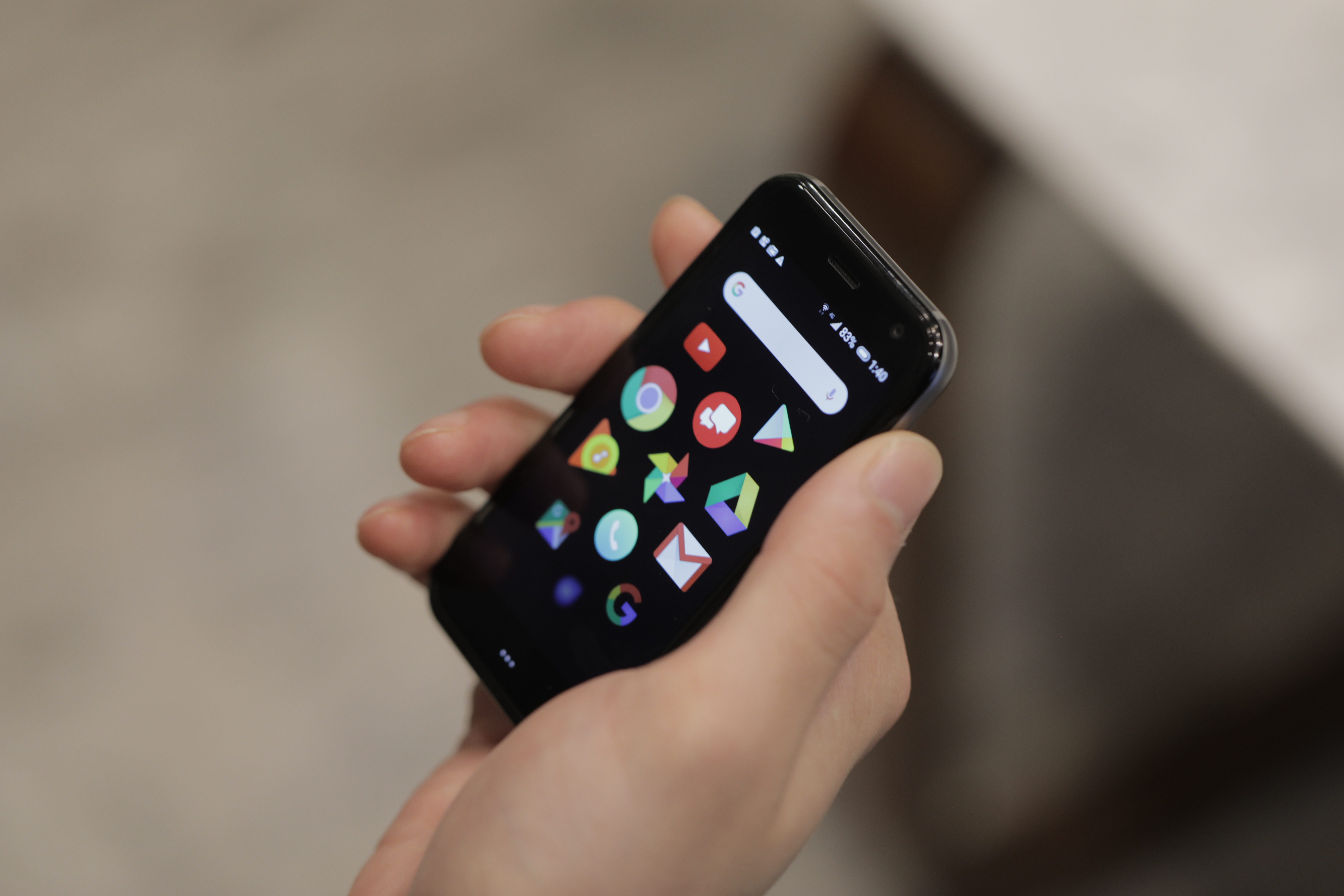
Palm was created to be your phone away from phone. It’s the 3.3-inch device you carry around when you don’t have space for a phone that’s double the size — be it the gym or a trip to the corner store. It’s a device that slips snuggly into the change pocket of your jeans or straps comfortably to your arm when going for a run.
It brings more standard smartphone functionality to the table than a smartwatch, with a screen size that’s roughly double that of the largest Apple Watch. It’s a product for those who can’t quite be away from their smartphone for long enough to justify the cost of an LTE watch.
That’s already a pretty small sliver of the gadget-buying public. Add to that the $349 price tag, and Verizon exclusivity, and you’ve painted yourself into a fairly small niche here. Palm told me in a briefing that it has pretty modest expectations for this first generation, given how perfectly the stars have to align to make someone the ideal consumer. I do appreciate the candor, but wonder how sustainable such goals will ultimately be in the long run.
I’ve been carrying Palm around for a few days now, and reactions tend to follow a similar arc. It generally plays out something like this:
- Hey, what’s that?
- Oh, that’s adorable.
- So, what’s the point?
It’s true, of course, that smartwatches got tripped up in that third bit for quite a while, especially before the Apple Watch came to market. But Palm, on top of its other concerns, now has a reasonably bullish smartwatch market with which to contend. The company has to eke out its market share in that roughly 3.4-inch crack of sunlight that sits between smartphones and smartwatches.
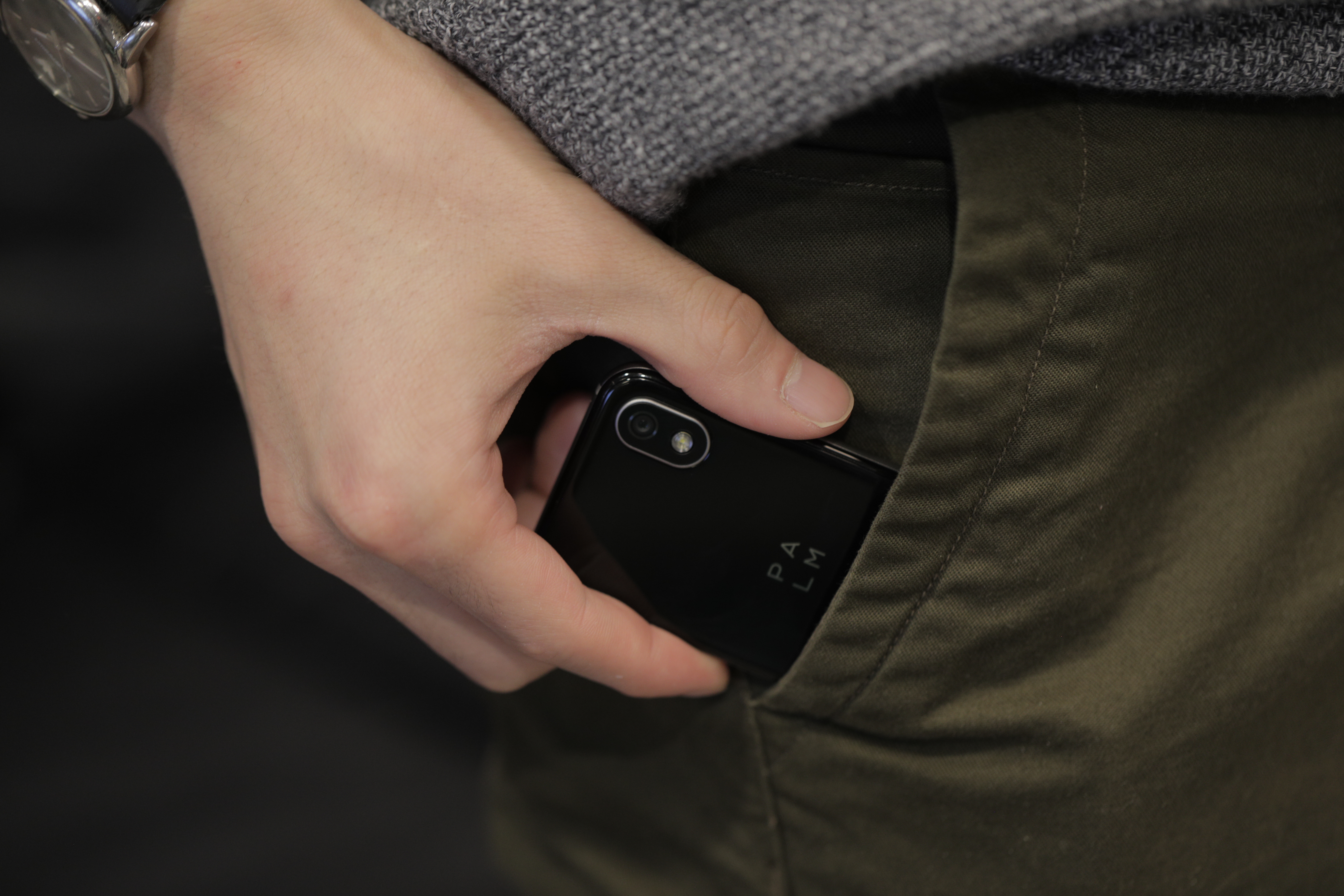
Palm started with this market in mind, an idea it took to TCL. The Chinese electronics giant was the one that first suggested licensing the Palm name. Unlike its deal with BlackBerry, however, TCL operates only as a manufacturing partner. The heavy lifting for hardware and UI design is being done in-house — and that’s a good thing. The Palm team employs a team of people whose resumes include companies like Frog Design, Google and Samsung. On a whole, the product has good product design.
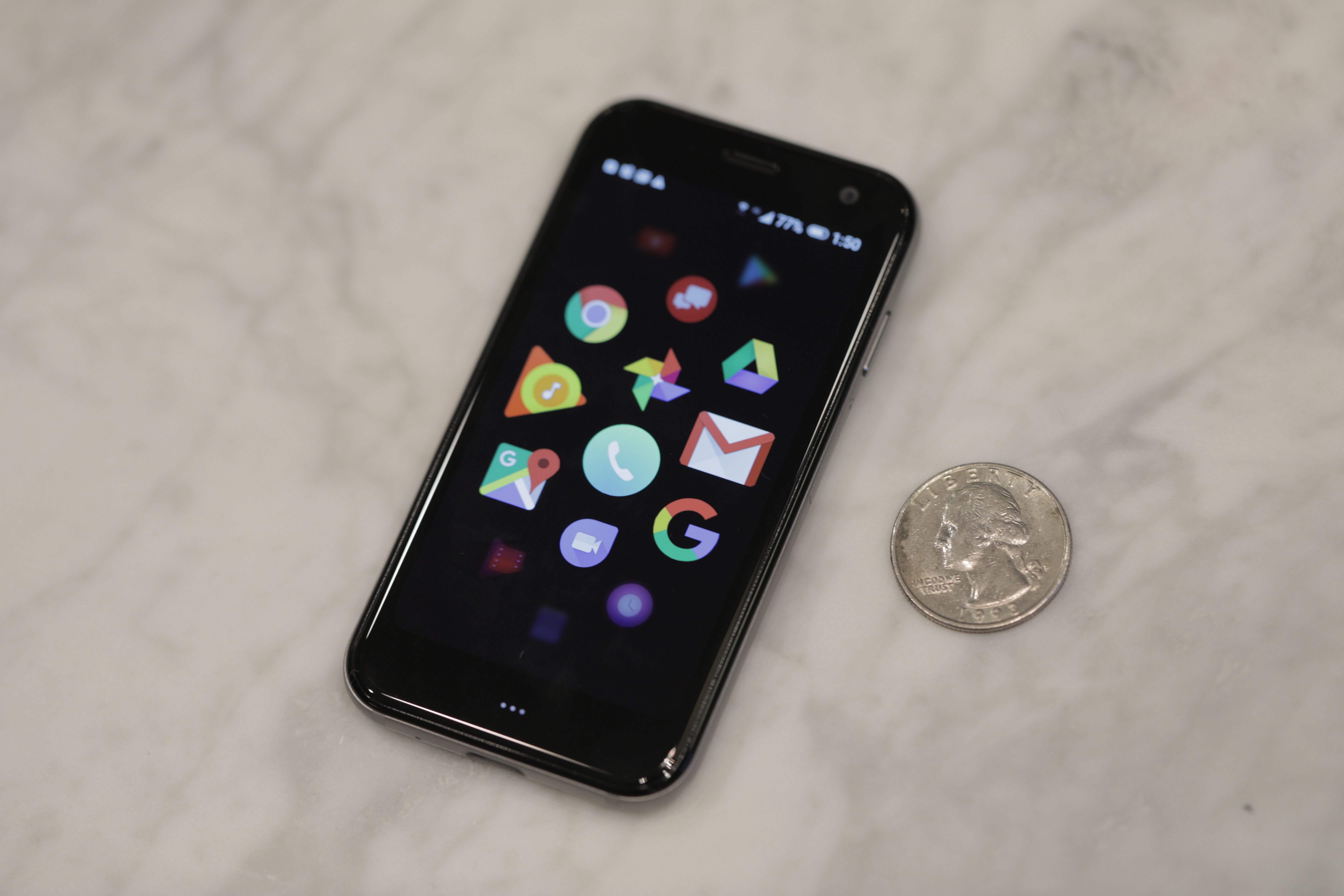
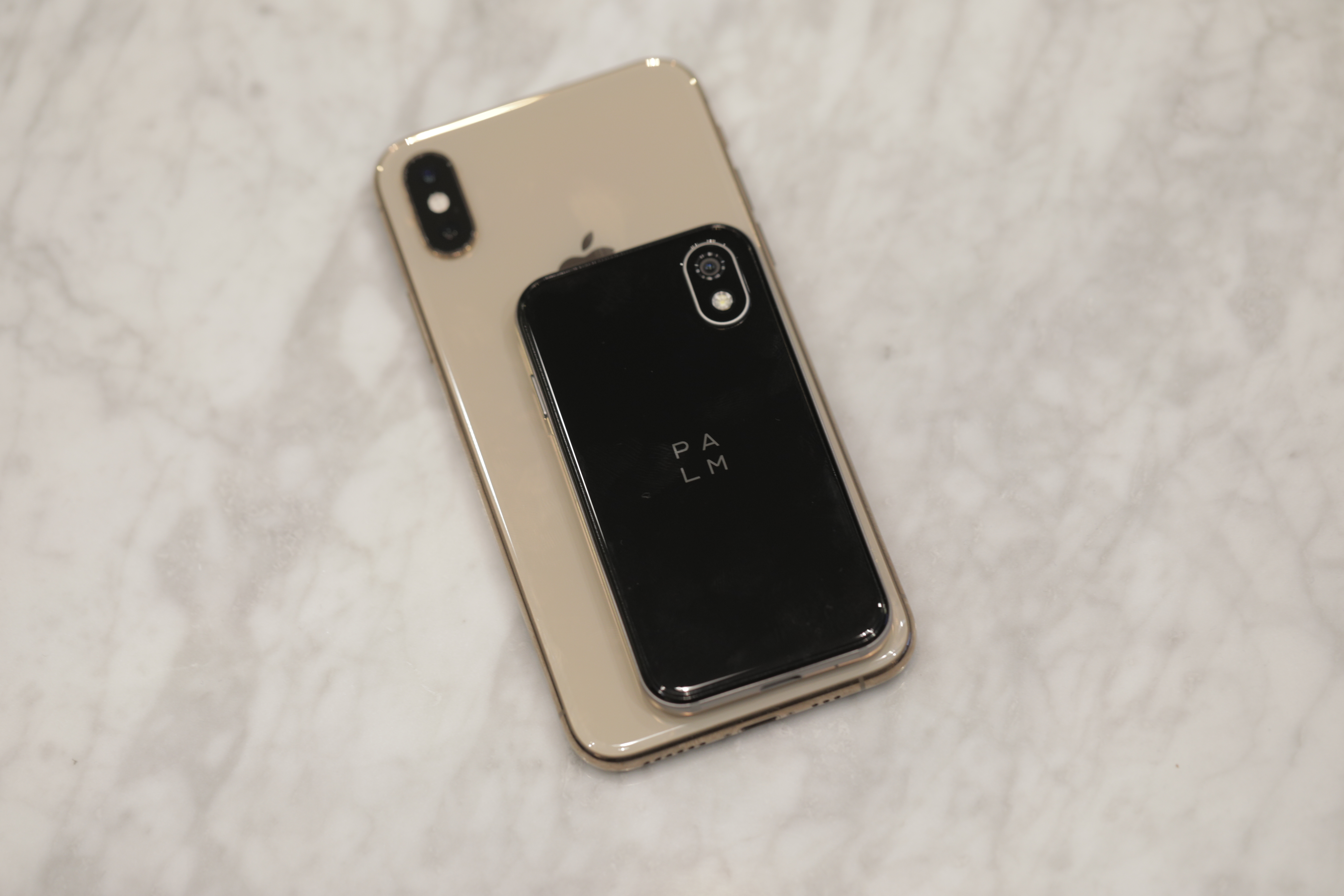
The hardware is solid, and you can’t really argue with product design that’s essentially a shrunk-down iPhone. At 3.3 inches, the screen is a hair smaller than the first iPhone’s 3.5. Of course, smartphone design and component manufacturing have come a long way in the intervening decade. The current screen-to-body ratio means a device that can, as advertised, fit pretty comfortably in the palm of most hands.
Of course, the small body is going to come with certain sacrifices. We’ve already come to accept many of these on our smartwatches, though based on application and form factor, we generally have entirely different expectations with regards to what the product can and can’t do.
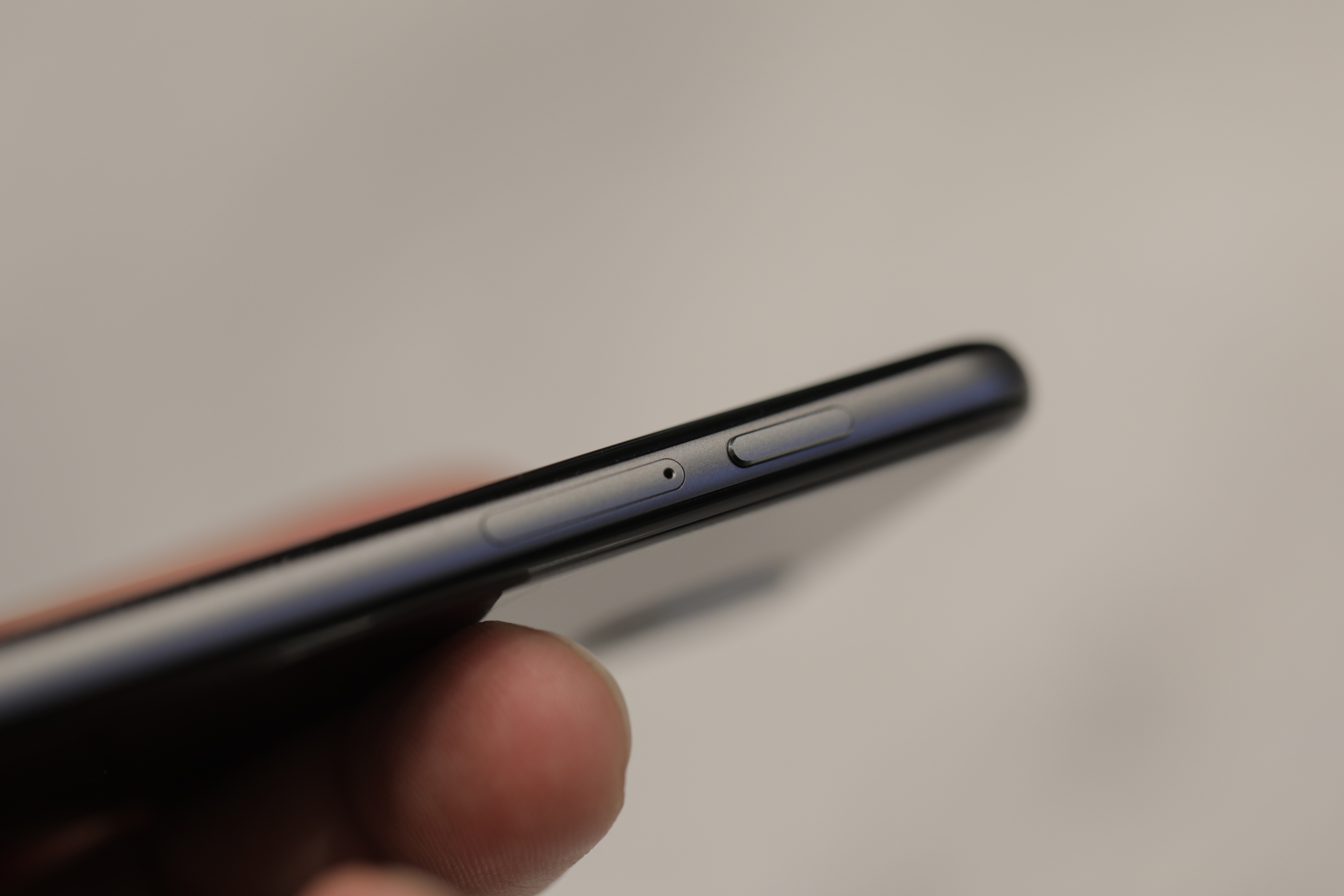
The Palm, on the other hand, is simply a small phone. And yet, there are things you either can’t do — or simply wouldn’t want to — with the product. Among the more surprising omissions here is the inclusion of one physical button (power). Palm has made the most of this by including shortcuts — you can tap twice to trigger the camera, for example. But the absence of a volume rocker is pretty glaring. When I needed to adjust it, I found myself clicking through several screens, into the settings. So much for convenience.
The display itself is 720p, which is going to be a tough transition, if you use a flagship device as your daily driver. The colors also look washed out when placed up against a pricier device. I wouldn’t recommend consuming much media beyond the occasional quick YouTube video.
Aside from the tiny screen, attempting to listen to music or talk on the phone will make you hyper conscious of the limitations of an 800mAh battery. On my first day with the device, I unplugged it at 7AM. By noon, it was dead, in spite of some fairly light usage.
I thought I would be able to eke out a little more time, but while scrolling through some news stories just before 12PM, the battery suddenly dropped from 10 percent to three and then down to one before shutting off. The upside of a small battery, however, is that the thing charges up pretty quickly. Using a standard USB charger, I was able to get the battery from 0 to 100 in around an hour.
Palm, of course, will tell you that the device is not intended to be a daily driver. Fair enough. And the company has included some “battery-saving tips.”
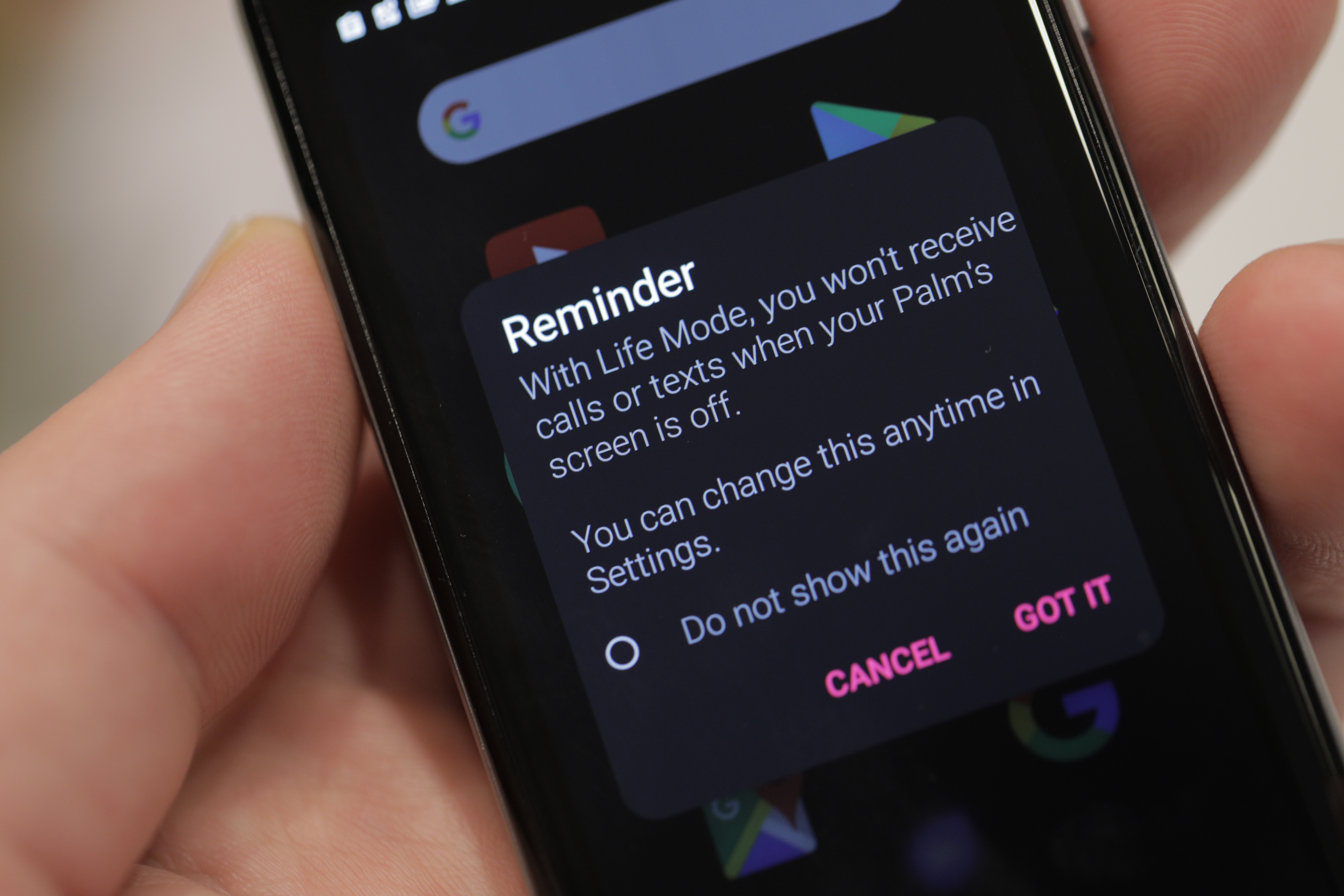
- You can go to Settings > Users & accounts > Turn off “Automatically sync data.” This will prevent background syncing of apps, so they only refresh when you open them. Major battery benefit.
- Use Life Mode. It’s great. If you are really anticipating calls or texts, use the Life Mode timer to temporarily suspend Life Mode.
- Use battery saver in the quick-settings menu.
- Disable apps you do not use in Settings > Apps.
- Minimize notifications.
- Disable vibrations.
- Charge it while you use your big phone.
Helpful, perhaps, but not exactly the kind of inclusion that confirms the “all-day battery life” suggested in the press material. Tellingly, the phone suggests turning on “Life Mode” by default during set up. Ticking that box “helps you live in the moment and minimize digital distraction,” which is marketing speak for turning off notifications — something that have become a core piece of functionality for many smartwatch wearers.

[Left: Palm, Right: iPhone XS]
The camera, meanwhile, while resembling the layout of the XS, is a single 12-megapixel lens, with the second spot housing the flash. It’ll work in a pinch, but you’re going to want your main phone for most photos, particularly in low light.
The virtual home button also does a lot of heavy lifting. Tap the three white dots once, and you’ll go back a screen. Double tap and you go home. Hold it down and the task switcher pops up, showing you a carousel of all of the apps you have open. Swiping up from the lock screen, meanwhile, will pop up the Gesture Pad.
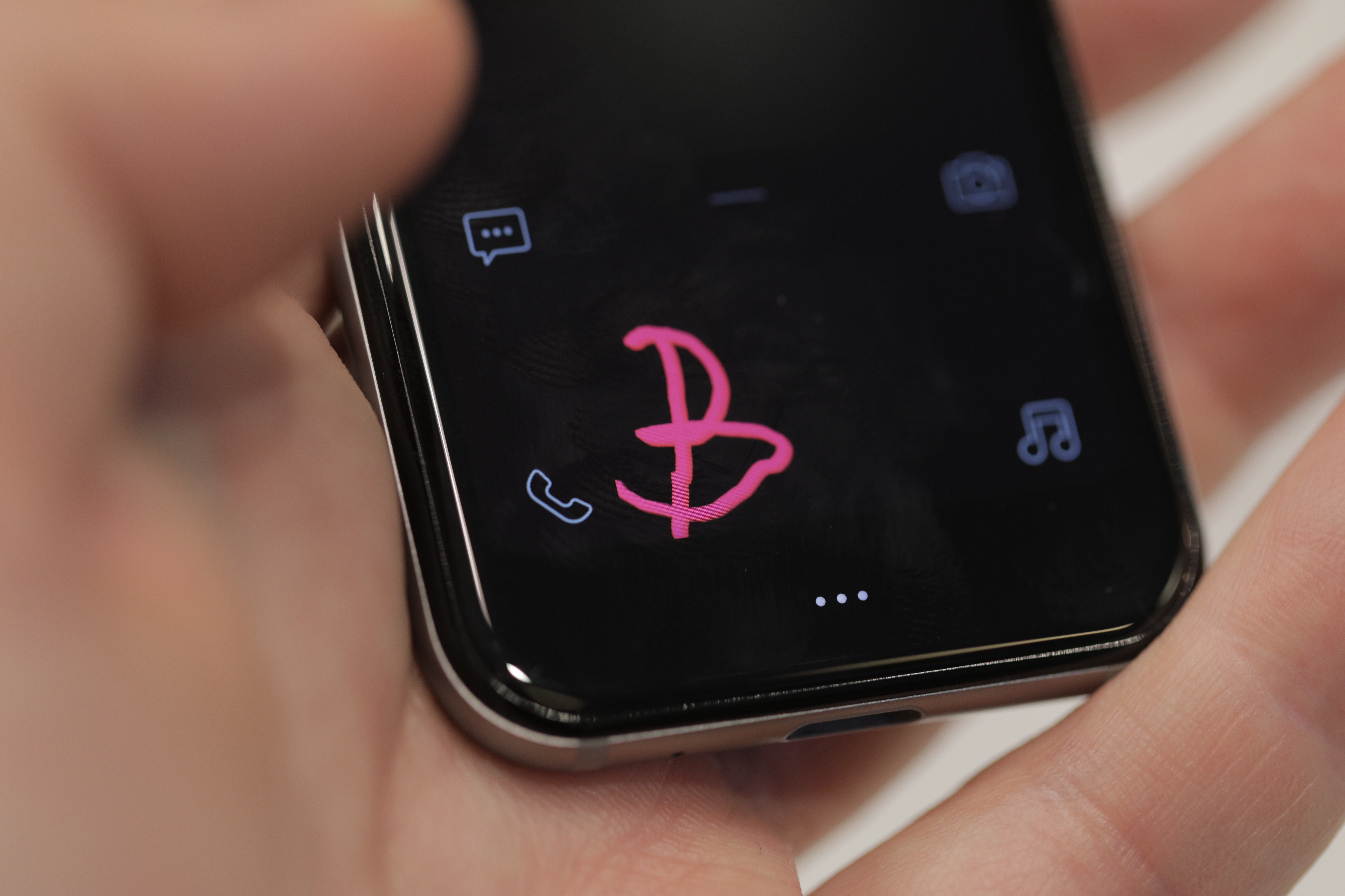
One of the more innovative software elements, the feature harkens back to the old PDA days. Use you finger to scribble a quick “S” and it will pop up Settings, Slack, Spotify and Sound. It’s a quick workaround that makes the most of limited screen real estate.
In fact, that’s the through line behind all of the design choices made to the UI here. Rather than stock Android, Palm does away with the desktop, instead defaulting to an App view. The design splits the difference between the Android app tray and the UI found on wearables like the Apple Watch.
It’s essentially a scrollable list of large icons that dynamically prioritize themselves based on use. You can also manually drag and drop them to your heart’s desire. This being a Verizon exclusive, there are a couple of pieces of VZW bloatware at the bottom, and it seems you can’t manually delete them, which harkens back to the bad old days of carrier partnerships.
A lot of these choices can ultimately be written off as missteps for a first-gen device. Certainly early adopters have come to anticipate questionable decisions from a new hardware startup. The hardware build is solid, and Palm’s made a lot of clever UI decisions to get around the limitations of a small screen.
The concept is compelling, perhaps, if viewed more as a modular display than a small phone, and some of the accessories play into that idea. Ultimately, however, the device never truly answers the question of why it needs to exist, or how it will fit into users’ lives outside of a few minutes during the day.
And while $349 is a fraction of the price of a flagship device from Apple or Samsung, Palm is asking users to spend that in addition to their regular phone (plus an added $10 a month to their Verizon bill). Justifying all of that is a big ask from a little phone.
Of course, I’m open to the possibility that maybe the new Palm simply isn’t for me. I’ll leave you with Lucy to mull over that possibility. She’s all ears: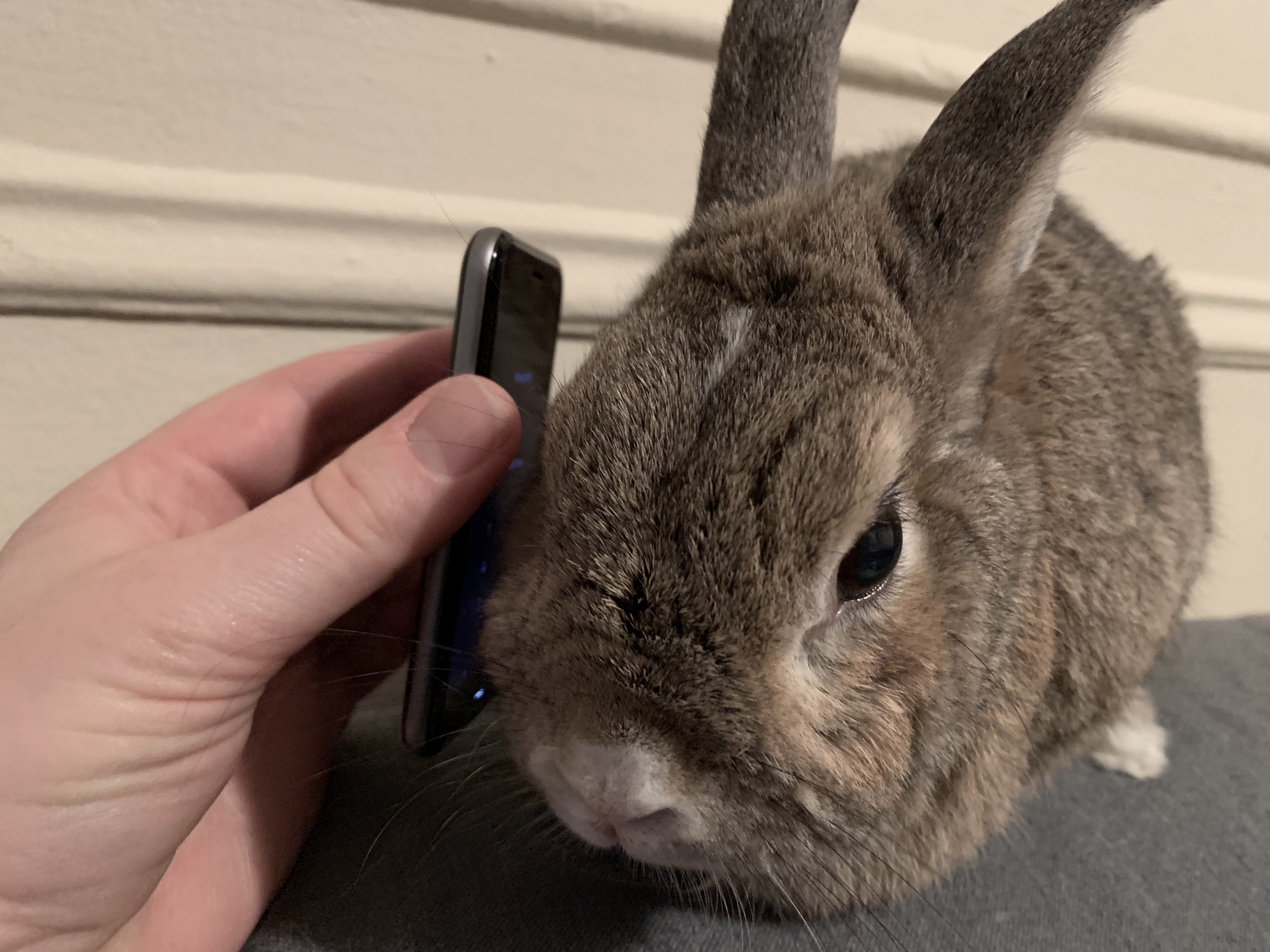
from TechCrunch https://ift.tt/2AI1V5T

No comments:
Post a Comment