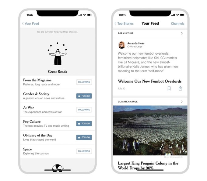
The New York Times announced on Friday how it’s adding its own take on Facebook-style News Feed to its mobile app. Yes, literally a news feed. The publication says it will now allow its iOS app users to customize their reading experience through a new feature called “Your Feed,” which consists only of those channels readers choose to follow. Some of those channels will pull stories from existing New York Times sections and columns, like Modern Love, while others, like Gender & Society, At War, Pop Culture, and more will pull news from across the paper’s sections. And others will include commentary from reporters and editors, and will feature worthy reads from outside The Times.
This additional context will only be found in this personalized Your Feed section, and is something the publication says is an experiment in terms of bringing another layer of insight to the news and stories. On the technical side, the commentary itself is actually pulled from The Times’ Slack, through the use of a bot built by backend engineer Brandon Hopkins. It basically turns Slack into the CMS for publishing these short posts to the Your Feed section of the app.
The design team equates the Your Feed reading experience to the way people tend to peruse a printed newspaper. Beyond reading the front page news, people will often pull out the sections they want to read, and then thumb through them – coming across other stories they want to read. And different readers will gravitate towards different sections and articles.
It says the idea for the feed came from its user research, where it found that many people wanted a separate place from the home page to follow a customized feed of content.

With The NYT outputting around 160 articles per day, it’s very difficult to be a comprehensive reader of the paper in its entirety, of course. But the app already allowed users to poke around in its many sections by tapping through its navigation. With the addition of a personalized feed – as on Facebook and on other social apps – there’s always the danger that people will begin to box themselves into their own news bubble. If the app’s users start skipping the front page and other key sections to hop into this own custom feed, they could potentially miss important news.
Hopefully, readers will choose to use the new Your Feed feature as something that’s additive to their overall news reading experience, and not as a stand-in for actually reading the paper itself.
Additionally, The NYT says the sections will be curated by its editors to ensure there’s a diverse selection of stories available. (Thankfully – news curation left up to A.I. and algorithms has proven time and again to be a disaster. So much so that Facebook finally gave up, and ditched its Trending news section altogether.) Plus, by having a human-programmed section, the editors can ensure not to overwhelm readers with stories.
To use the new feature, readers in the iOS app will be able to pick from one of 24 channels they want to follow – an idea that’s not too unlike the way users follow accounts on social apps like Twitter or Instagram. To then read through this section, there will now be a new space in the iOS app labeled Your Feed.
Going forward, The NYT says it will tweak the experience further by adjusting the channel selection, offering more ways to follow channels, and rolling out other features, while responding to user feedback and behavior to inform its design choices. It will also experiment with different versions of saving stories, notifications, and ways to better manage your interests in the app.
The feature is rolling out to The NYT iOS app on iPhone and iPad for the time being. User feedback will determine if it expands to more platforms, the publisher told us.
from TechCrunch https://ift.tt/2Kv4PNa

No comments:
Post a Comment